How to frame and compose great photos
Great photography isn’t about what kind of camera gear you’re using. It isn’t about the mega pixel count. Great photographers can take great photos with any camera. I don’t think people are too concerned with the kind of camera Henri Cartier-Bresson used, and I’m sure someone like Joe McNally could bring home a winner with a simple point and shoot. A good example is Damon Winter’s photos of life in Afghanistan on his iPhone. That being said, I do love my pro DSLRs and the wonder of Nikon’s top-shelf glass in their lenses, but that’s besides the point. We’re talking about composition.
Great photos are all about composition, light and moment. In three earlier posts I talked a little about basic lighting, covering availablelight, flash, and mixing the two. In this post I’ll write a little about the importance of composition in a photograph and some easy tips on how to frame an interesting photograph.
Anyone can point a camera at something and press the button. It’s the people who look at that same thing and slightly alter the composition, making a striking photograph instead of a forgetful one.
That little box that is your viewfinder seems like a simple way to look at the world, but as you move it around viewing the scene slowly, adding some elements and subtracting others, it becomes clear that composing an interesting photo is a challenge that never ends. In school I was taught to constantly and obsessively pay attention to the edge of the frame. What makes it in and what doesn’t. Is something cut off by the edge, is it too centered, how much space do you leave around a subject and in what relation to the edge do you put it. How does the eye move around your composition.
Yes, you can crop things after the fact, but who wants to sit in Photoshop making simple adjustments that should happen in the camera. I’ve always advocated doing as many things in camera as possible, including lighting, moving details, framing, among other things, but I’ll write more about that some other day.
Back to framing a photograph. To start with, stick your eye to your camera and look around. Make sure you can see the edges of the frame. As you’re about to take a photo, look around the edges and see if anything is amiss. Is your model’s hand cut off? Is that group missing a few feet at the bottom? Too much space about someone’s head? Is everything looking too centered?
There is a push and pull between the edge of the frame and subject. The best photos are often the ones where the subject is off-center, creating a visual interplay with the open space on the other side of the photograph. Sometimes centering the subject will create a great photo, but generally you should be thinking of putting emphasis on the ‘thirds’ of the photo. If you break up a frame into thirds, both horizontally and vertically, where the lines intersect are strong visual points. That’s where you should be aiming to put your subjects. I’m not saying don’t snap a photo of the centered version as well, but start by placing your subject in those thirds and you’ll immediately get people commenting on your photos.

Just by simply moving your subject off center will help to create more visual tension and add some life to your photo. Obviously there are many instances when you don’t want to put something off center, but by adding this simple technique to your repertoire, you will start to see the world in a different way. So glue your eye to your camera and start moving it around. Practice by finding a simple subject, and take two photos (or two hundred), one centered, one off center and see which has more power visually.
There’s a reason why cameras have their focus points around the sweet spots of the thirds. If you shoot a lot of action or you like to use continuous focus, you can set up your framing so that you set your focus of one of those intersections and voila – an interesting photo.
Let’s take a look at a few examples.

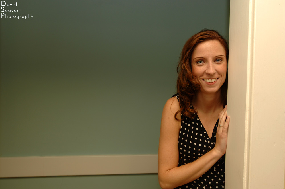
Nikon D2x, 17-35mm, f3.5, SB-800 bouncing off ceiling
This was a quick grab shot of a bride’s maid at a recent wedding I shot. She was peaking around the door watching the bride get her makeup ready. The mood was light and everyone was in a good mood. I only got off one frame and had only a second to frame it, but as soon as I turned around I knew I wanted her hard to the right, leaving the open green of the hall wall to fade off to the left. If I had centered her, the door jam would have become a much stronger element of the photo when I wanted to keep it focused on the woman.

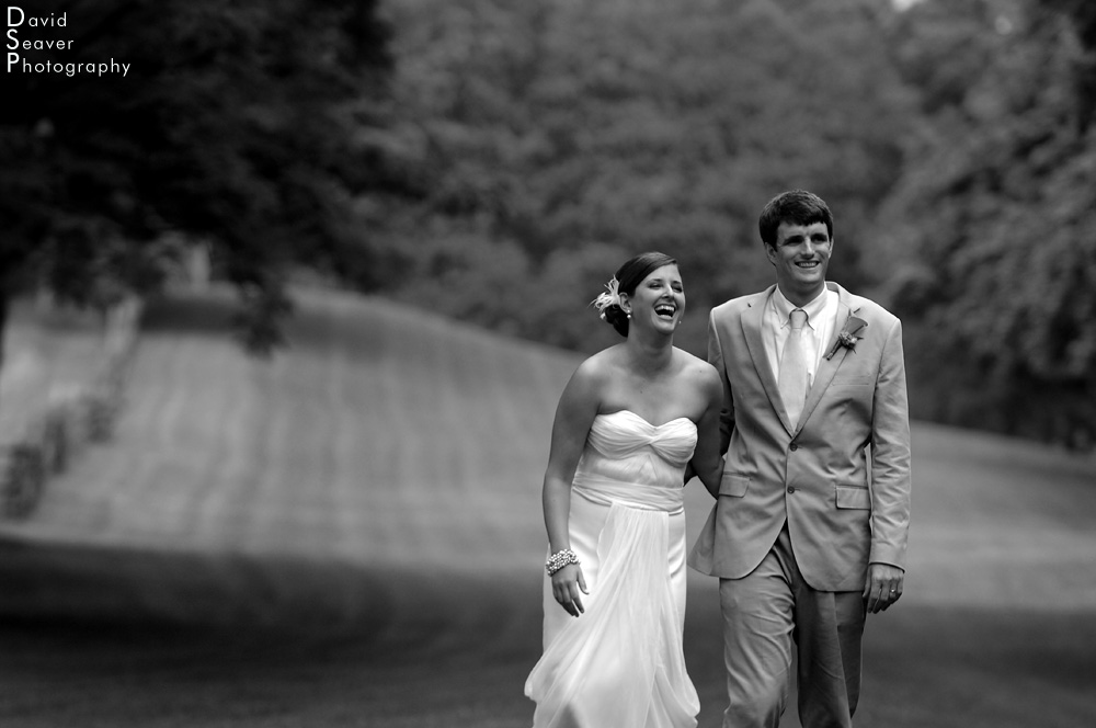
Nikon D2x, 70-200mm, f3.5
Here’s another wedding photo that I think illustrates the point of placing your subjects off center to add some depth and visual energy to the photo. Keeping them off to the sides lets your eye follow the mowing lines in the grass right up to them.
Of course, as they took this little stroll, I fired off about a hundred other shots of them, always trying to mix it up, move them around in the frame, working the depth of field, switching to a wider lens, basically everything I could think of to keep it interesting.
Anyone who thinks that cameras capture the world exactly as it is should think about this. With every photo that I take, I make decisions about what/who makes it in, and who gets left out of the frame. Some of the photos that have the calmest look, can actually be bits of a larger scene that might be total chaos, but left out of the photo. Each photo is filtered through the photographer’s eyes and cropped the way they see fit. Do you include the pile of trash next to an otherwise beautiful landscape? My answer is generally to make more than one photo, some of just the landscape, and some with that big, stinking pile of trash in one of my frame’s sweet spots, showing there’s always a story behind a photo.

Nikon D2x, 50mm, f2
Working with depth of field is an easy way to use composition to your advantage. With this photo of a newborn in the intensive care unit, I used a shallow depth of field to isolate the baby’s tiny fingers and hand. I placed the hand in the bottom third of the frame, allowing the out of focus ear and head to take up the top half. Instead of centering the hand, I chose to keep the photo simple and concentrate on two aspects, the hand and the head.

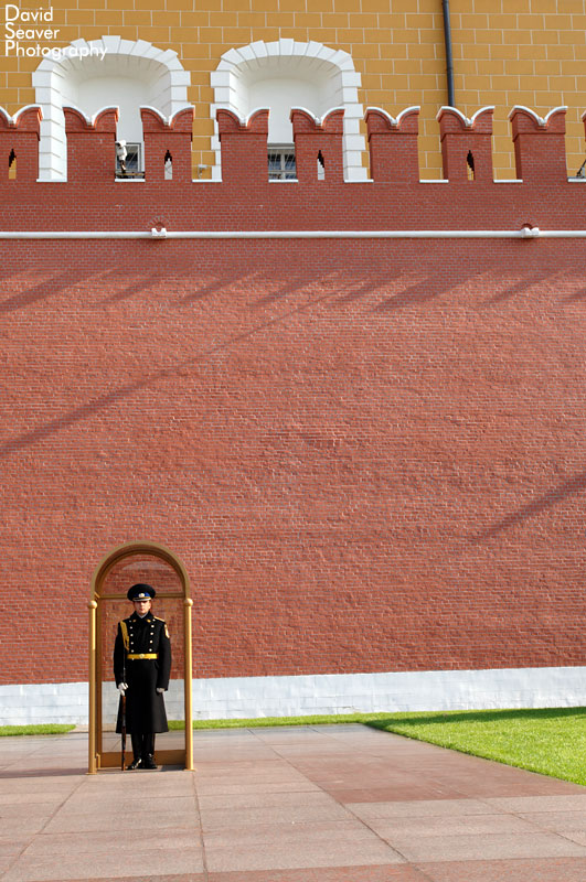
Nikon D2x, 17-35mm, f5.6
Working with what was in front of me determined how far I pushed this guard off center. After taking a few shots of the overall scene, (there’s a flame off camera left), I thought that by letting the vast expanse of the Kremlin wall take up a majority of the frame it would give a sense of scale to the photo. I would have gone wider, but there was distracting shrubbery off to the right.

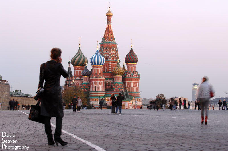
Nikon D2x, 70-200mm, f4
Another quick grab shot of this woman talking on her phone in Moscow’s Red Square. By placing her off center it adds visual weight, showing a connection to St. Basil’s Cathedral in the background.
Framing is something that is a constant challenge for photographers. I know that I when I start to get tired, my compositions tend to lack that something extra. It takes mental energy to be constantly composing the world around you into a rectangular space. It’s why photographers can always take a better photo. Or at the very least, they can continue to try and create a better photo.
So take those extra seconds to really look through your viewfinder, scan the edge of your frame, and move the camera around.
To see more of my work or to contact me about a project or assignment, please visit my website, www.photovt.com.


Leave a Reply
You must be logged in to post a comment.